
Understanding Color Out in the World

I really love color… If you're new here that might be news to you, but if you’ve been here a while you know this about me. :-) The thing is that color has taken me down a rabbit hole I never expected.
It all began about eight years ago when I was thinking about starting a creative business. I’ve been in love with color my whole life, I think, but I wanted to take it more seriously and understand it for the first time. The first thing I did was start to pay attention to color and how it was used out in the world. I started to see interesting repetitions, or patterns otherwise known as trends. This made me even more curious. Who starts these trends, and how are they taking off over and over?
By trends, I don’t mean trendy.
Most of the time, I find that trends are just deeper stories about what’s going on in the world at any given time. You can look through history and see trends, like how hairstyles were worn in any given decade or century. It tells a story about what was going on in that period of time, and stories are important. It’s part of our history. Did you know that avocado green dominated the 70’s because there was a big movement toward nature back then? In fact, all the colors that remind me of the 70’s, like the mustard yellows and burnt oranges, were earth tones. Now with conservation in full swing, green is back in full force.
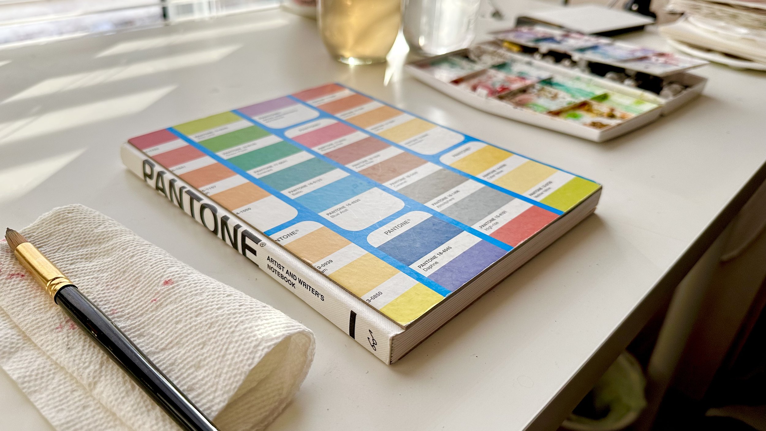
So when Pantone comes out with a Color of the Year, I kind of get excited. If you don’t know about Pantone, they are a trusted source of color experts who have been shaping color choices in many industries since the 1950’s. They solved a big problem for creative professionals looking to partner with others by instating a global color standard. They named and numbered thousands upon thousands of colors, and put them in a database.

Surface designers, interior decorators, fashion designers, auto designers, and more, could now send a swatch to manufacturers or clients, to be approved and signed off on. Before this standard existed, how could two parties agree on a color that was communicated based on individual interpretation? It was a mess to say the least. It’s comforting to know I can partner with someone across the globe and get the colors right.
Pantone filled a huge gap for creatives, allowing them to work more efficiently.
The other aspect of this is that Pantone employs powerful color psychology when choosing a Color of the Year. That color then becomes a message of the times. This year they chose Viva Magenta. It’s part of the red family, and it’s been selected in order to help bring society out of a pandemic state and into a bolder style of living and working once again. Click here to read more about Pantone and the Color of the Year here.

Pantone has become a part of my process and my life. As a watercolor painter, I love to challenge myself to mix the chosen Pantone color each year and tell it’s story. It’s really fun and very satisfying. The Pantone color of the year ends up in so many places. For example, clothing, vehicles, bolt fabrics, shoes, furnishings, and much more. I love to be able to incorporate this color in my current color palettes in case I want to match something. I tend to incorporate it in my own surface designs as well. Because consumers will be seeing much of this color in stores, my wares may be a nice compliment to something they have already purchased.
Do you watch for the Pantone Color of the Year each time? Or are you new to Pantone colors? I’d love to hear about it in the comments below!
Want to try your hand at mixing Viva Magenta? I’ve created a tutorial just for you! Click the button below to check it out. ;-)