
2023 Pantone Color of the Year in Watercolors

So it’s been decided once again. The Pantone Color of the Year has been announced as Viva Magenta 18-1750, an offshoot of the red family. They’re calling it, “an unconventional color for an unconventional time.” The new #Magentaverse (a.k.a the Viva Magenta world of imagery) also penned as “a new signal of strength” by Pantone’s executive director, Leatrice Eiseman. Pantone is more than just the leading color expert since the 1960s, they are storytellers who use color as their language.
How can color be a language? If you’ve heard of color psychology that businesses use to choose their brand colors so that they are sending the right message to their target audiences then you know how important the language of color truly is. As artists, we can communicate moods, styles, and other messages through color just by understanding a few guidelines. Finding color psychology blogs is an easy way to get a quick grasp on how color affects us as humans.

“Reds are power colors that celebrate life. As a bright, crimson red, Viva Magenta balances boldness with a feeling of fun.”
Pantone
Color theory is another wonderful world to dive into to learn the ropes. Sir Isaac Newton developed the first version of the color wheel in the 1660’s using glass prisms, inventing the primary and secondary colors in the process. Ironically, he did this while quarantining from the plague that was happening in England at the time (further proof that good things can come from a pandemic!). Color theory is loaded with facts and tips about how color works in relationship to itself to make great color combinations.
Pantone.com is another great source of info about how color works. They take into consideration not only what each color represents, but how each version of every color changes meaning slightly. They are like an encyclopedia of color knowledge! My favorite thing that they do though, is to map out what colors fit with what’s going on in the world right now. It’s quite a sophisticated process that requires much research and consideration.

For example, Pantone’s quote about Viva Magenta, the new color of the year, as “a new signal of strength” goes with our emergence from a pandemic as we figure out what new needs and desires we have. Our economy, business trends, leisure trends, and purchasing habits are very different now than in 2019. Our outlooks, goals, and aspirations have altered from all we have all lost and gained in the last 3 years. Viva Magenta embodies a global population looking towards hope and health.
“[Viva Magenta] embodies an expression of fierce grace, inspiring us to show up with confidence and humanity.”
Pantone
What a fascinating and most reassuring concept as we work to maneuver ourselves back to a more vibrant and fearless life for ourselves. Pantone not only makes themselves our commercial partner in all things color, but an encouraging force that pulls us into our better selves as people. I appreciate that encouragement as I work on my goals for 2023. I don’t feel quite so alone, and it gives me the motivation to spread this movement of positivity!
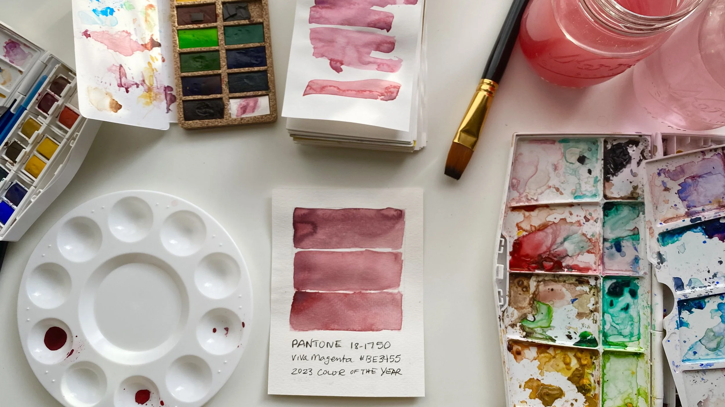
With all of this in mind, I got curious to see how close I could come to mixing Viva Magenta with my Viviva Colors Original pan watercolors. In fact, I found this cake frosting color mixing video on Pantone’s Instagram account that totally inspired me and gave me some ideas to get started.
Click the button below for a quick tutorial of my color mixing process with Viviva Colors watercolors. I hope you try it and use this color in your work to get a feel for it and spread the positivity.